THE BROADWAY WINE & BISTRO
SERVICES PROVIDED
creative direction • brand design • graphic design • copywriting • website design • marketing consult
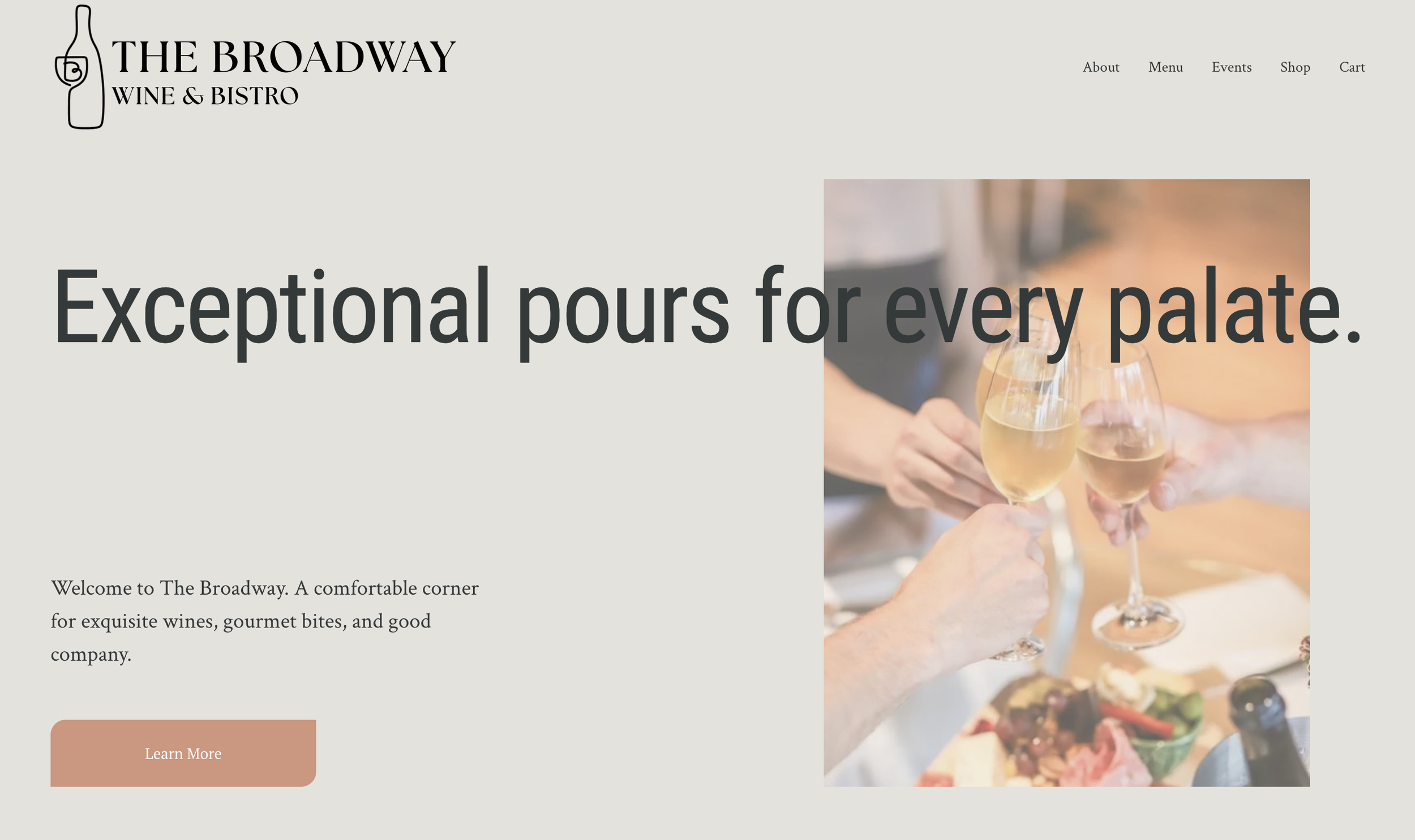
When a culinary mastermind and her family took the helm at Eugene, Oregon’s legacy wine shop and bistro, The Broadway, they needed a brand evolution that matched their new vision. The challenge was threading the needle between an everyday, welcoming neighborhood eatery and a premier destination for wine lovers of all types, including rare wine collectors. I guided the brand identity journey from concept to completion, establishing a versatile design system that was rolled out across a custom e-commerce website, printed menu suites, business cards, social media, and marketing collateral.
Logo Development
Originally the owners weren’t sure what type of logo they wanted for the business, so I cast a wide net, utilizing a number of designs to better hone in on their vision. The exploratory phase is one of my most favorites—I love experimenting with styles and chasing ideas.
ROUND ONE
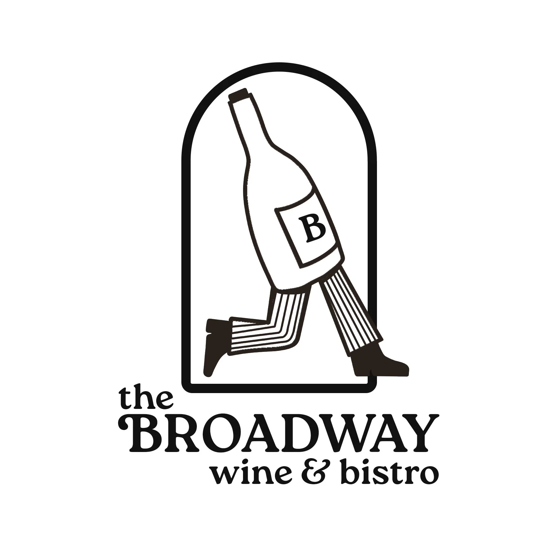
I was really charmed by the running bottle, which was a graphic nod to Eugene’s famous heyday in the 1970s, and a visual representation of the “bottles to go” concept of the shop.
ROUND TWO
ROUND THREE
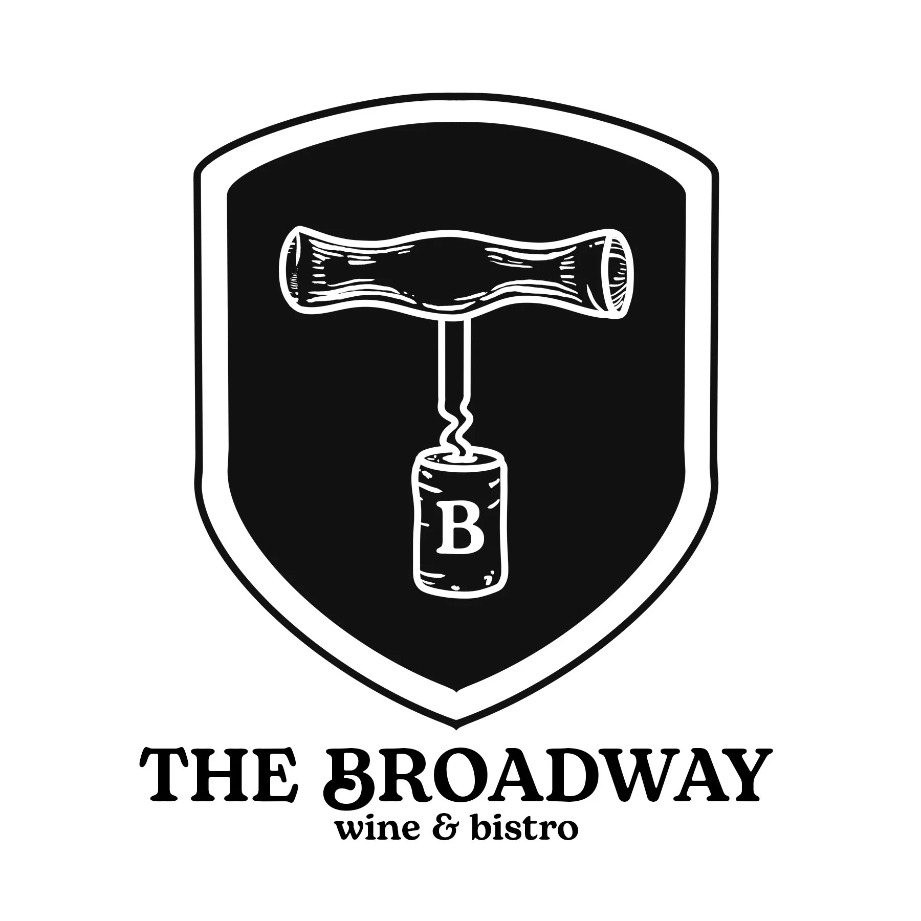
The owners requested to see the bottle opener logo concept, but at an angle and with a bit more dimension.
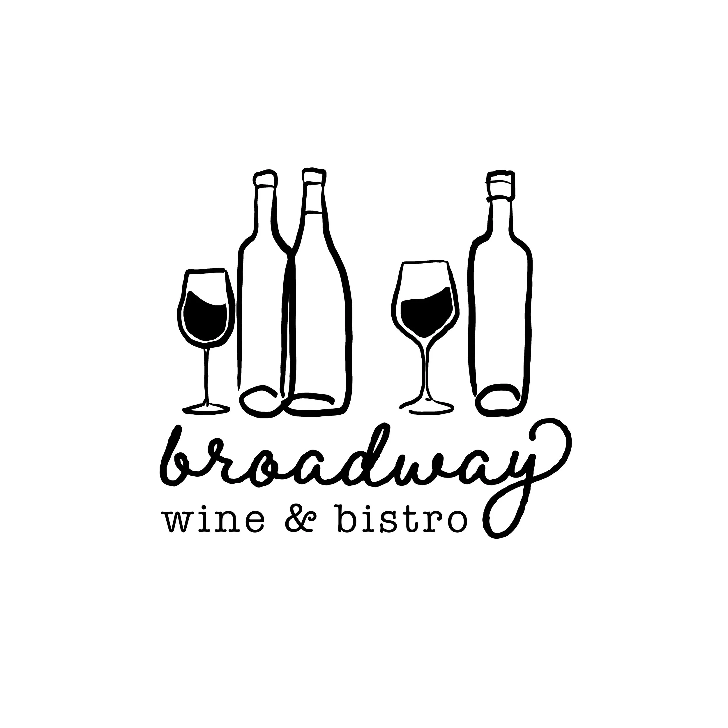
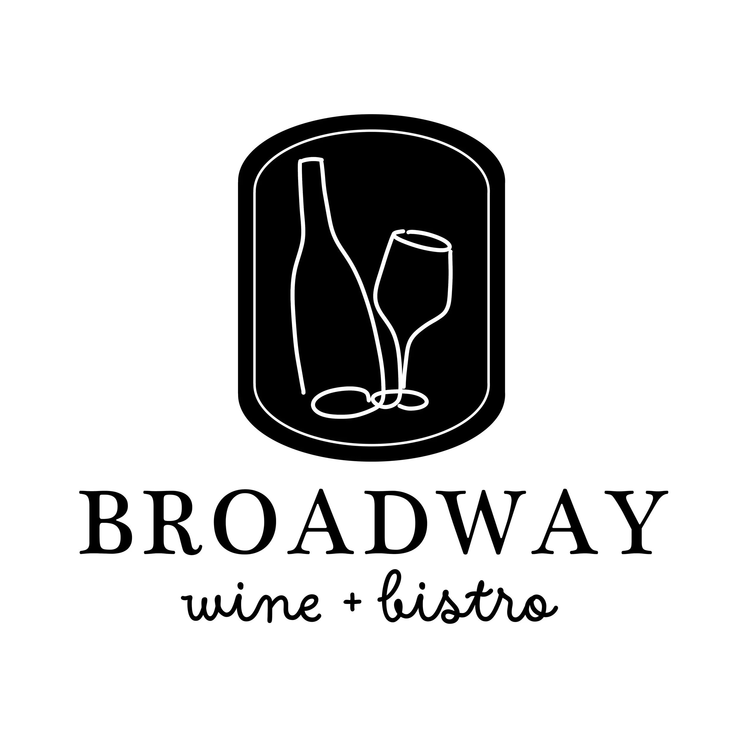
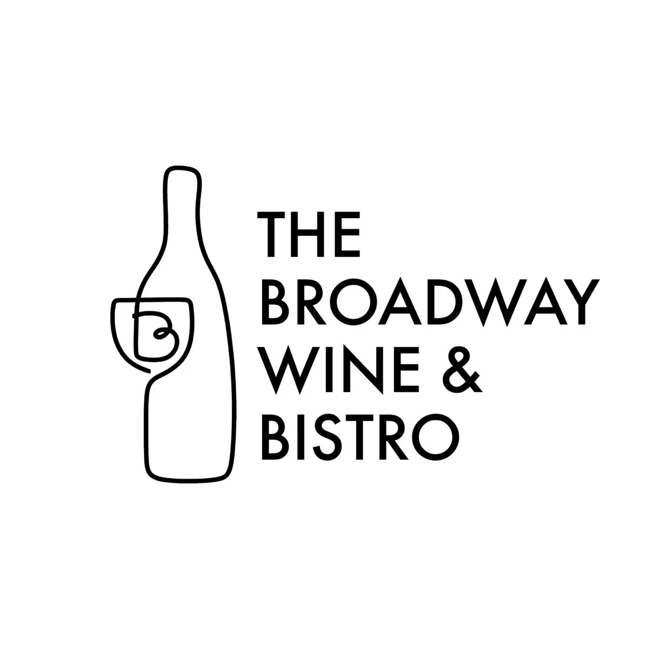
As the brand direction took shape, the owners discovered they were drawn to fluid, hand-drawn illustrations paired with elegant, refined typography. To capture the essence of a classic French bistro, I developed options that balanced sophistication with an effortless, organic feel—evoking the welcoming atmosphere of dropping in for a casual glass of really good wine or a meal with friends.
Among the concepts, the illustration featuring a wine bottle enclosing the "B" glass emerged as the clear favorite. From there, I explored tailored typographic variations to find the perfect pairing for the mark.
FINAL LOGO
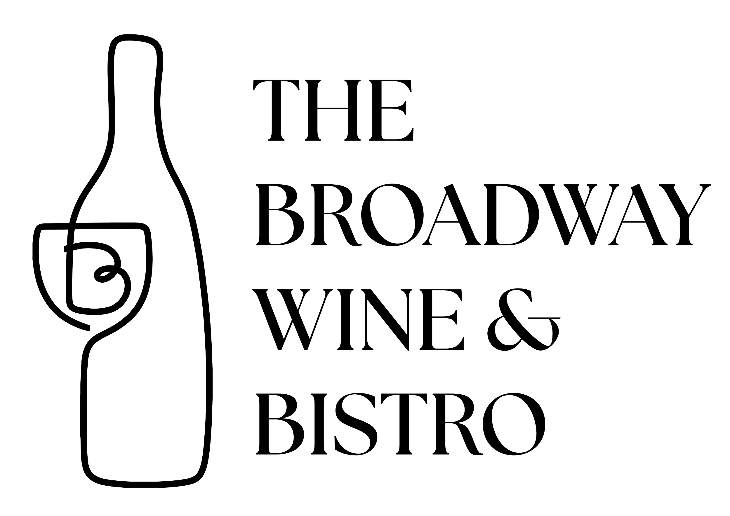
The final selected logo strikes the perfect balance for the brand. The refined typography grounds the organic, flowing illustration, delivering the elevated yet approachable aesthetic the owners envisioned. To ensure adaptability across all touchpoints, I developed a full suit of primary and secondary layout variations. Additionally, I extracted the custom "B" glass icon to serve as a standalone brand mark for social media profiles, favicons, and small-scale applications.
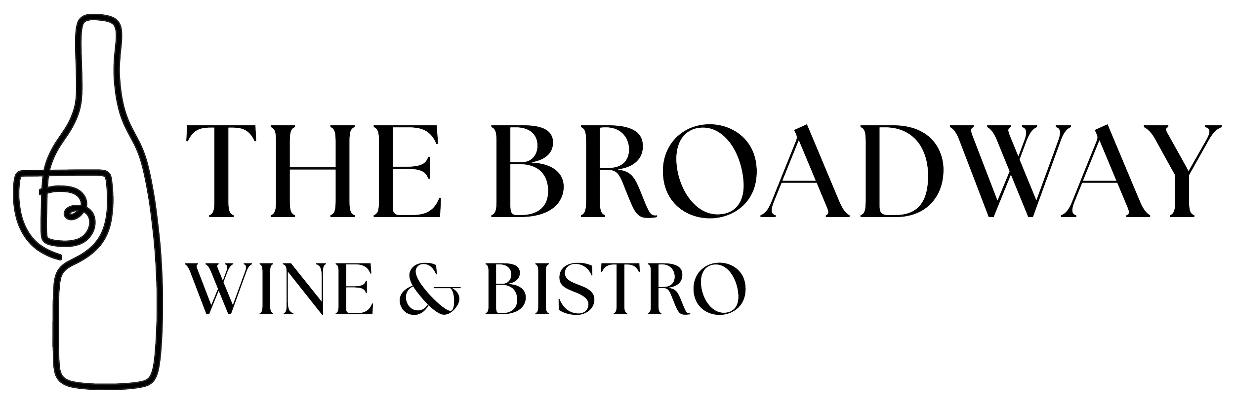
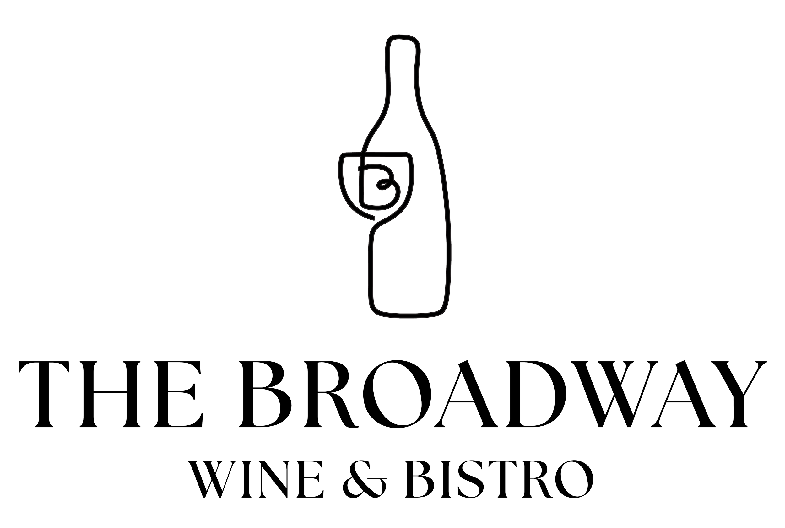

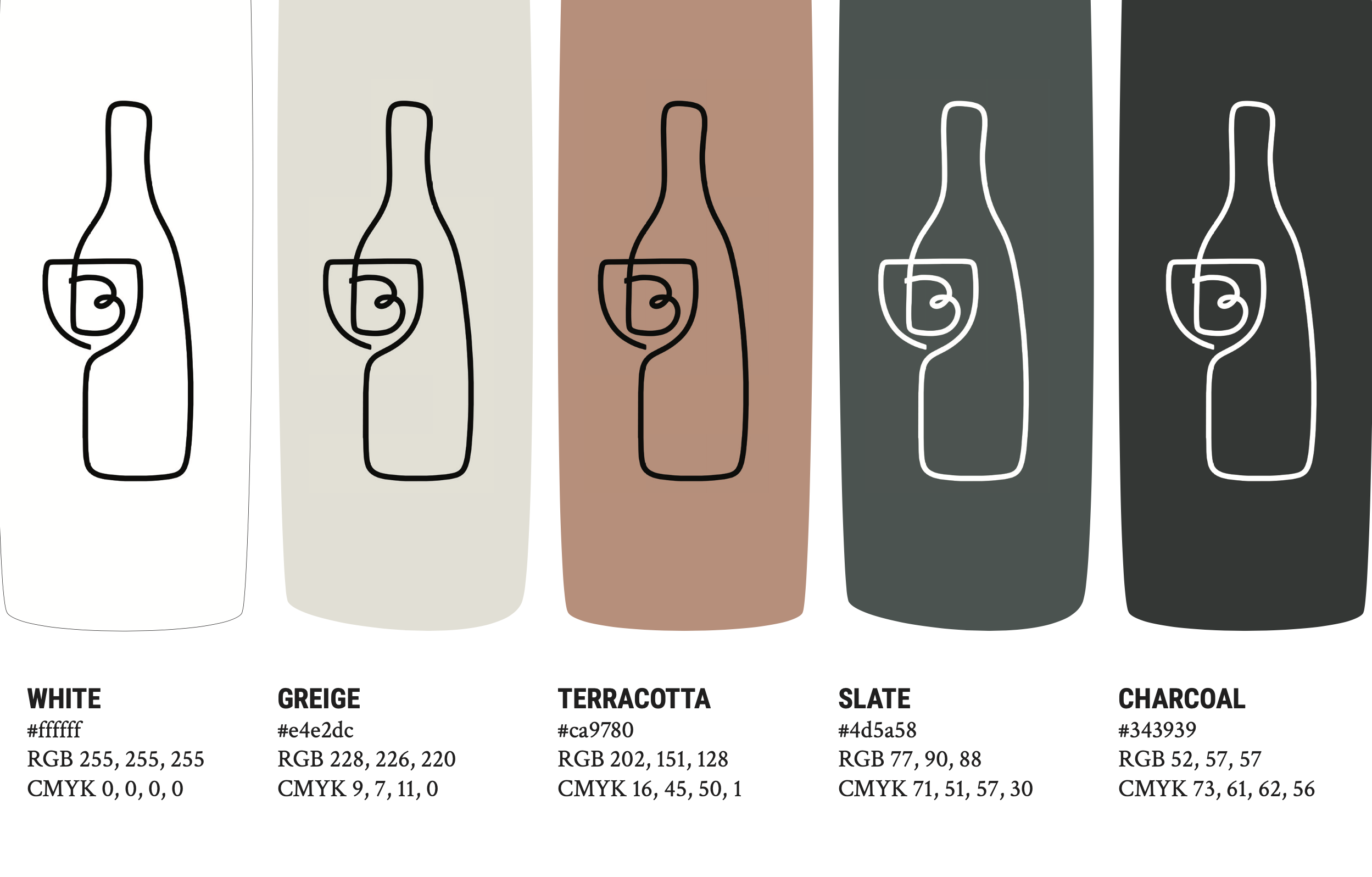
The color system continues the balance of warmth and sophistication. White and greige maintain a clean, readable canvas across the web experience, while slate and charcoal offer crisp contrast for typography and UI elements. Terracotta brings an earthy, welcoming pop of color that grounds the brand across both digital and physical touchpoints.
Website Design
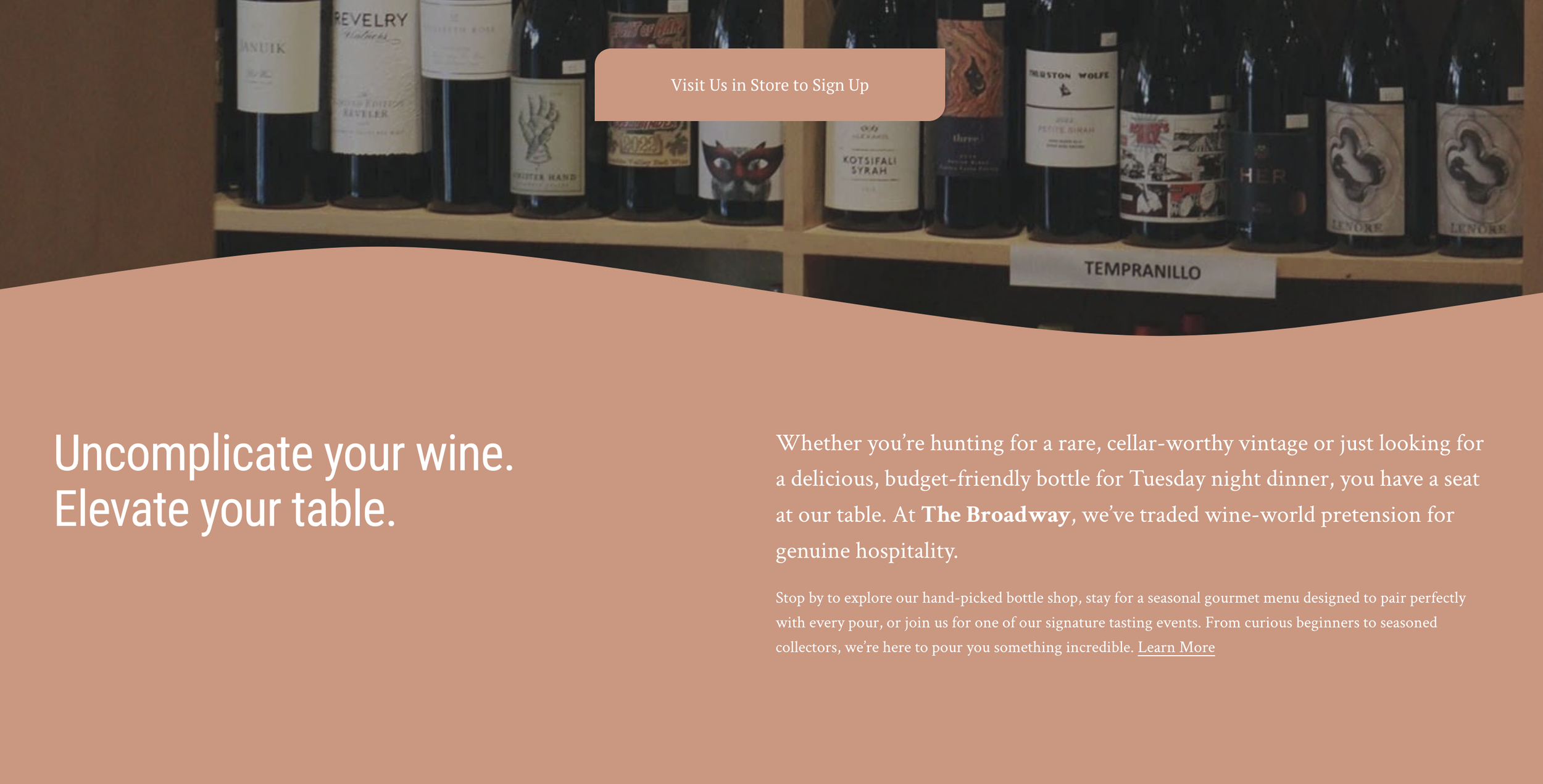
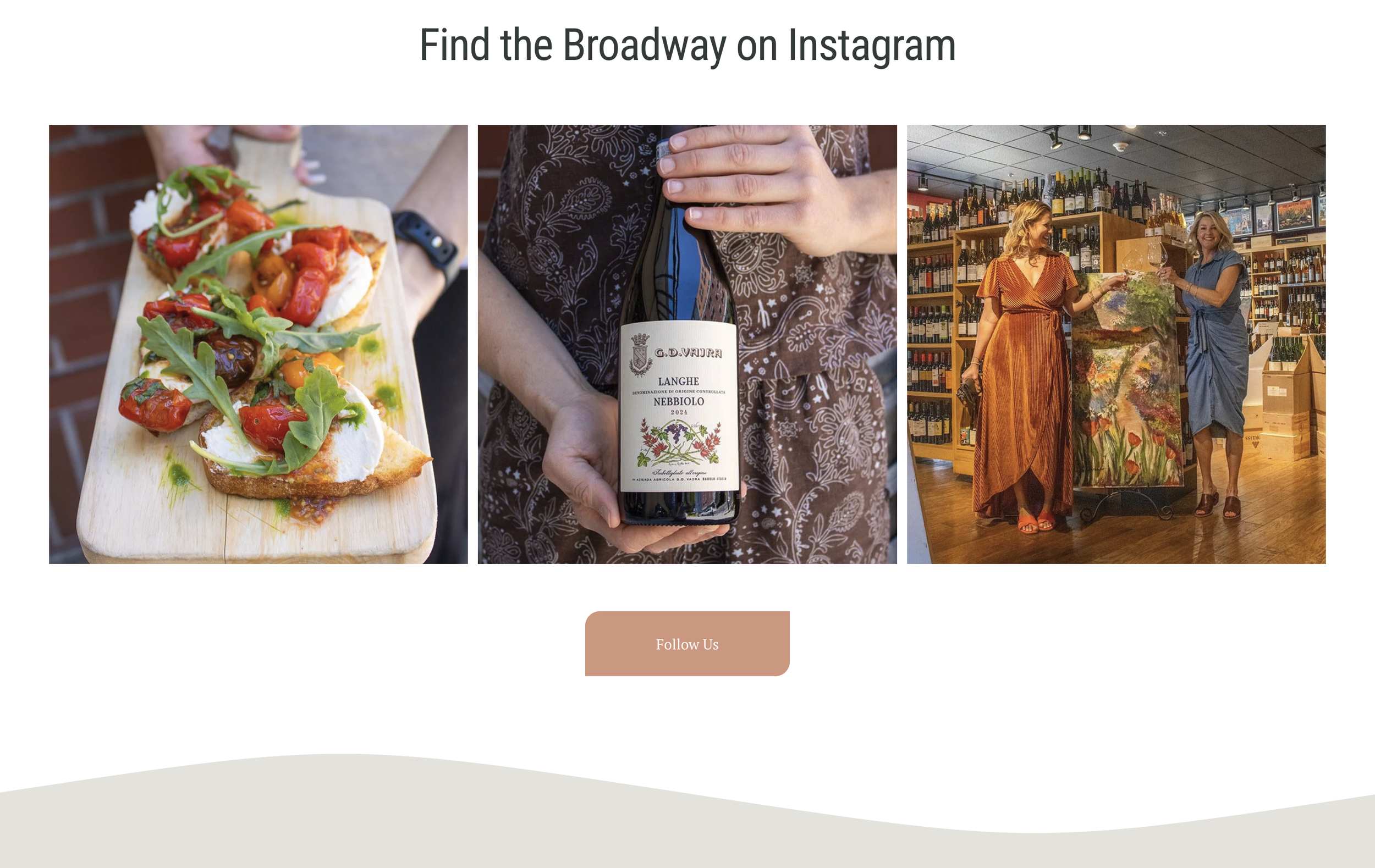
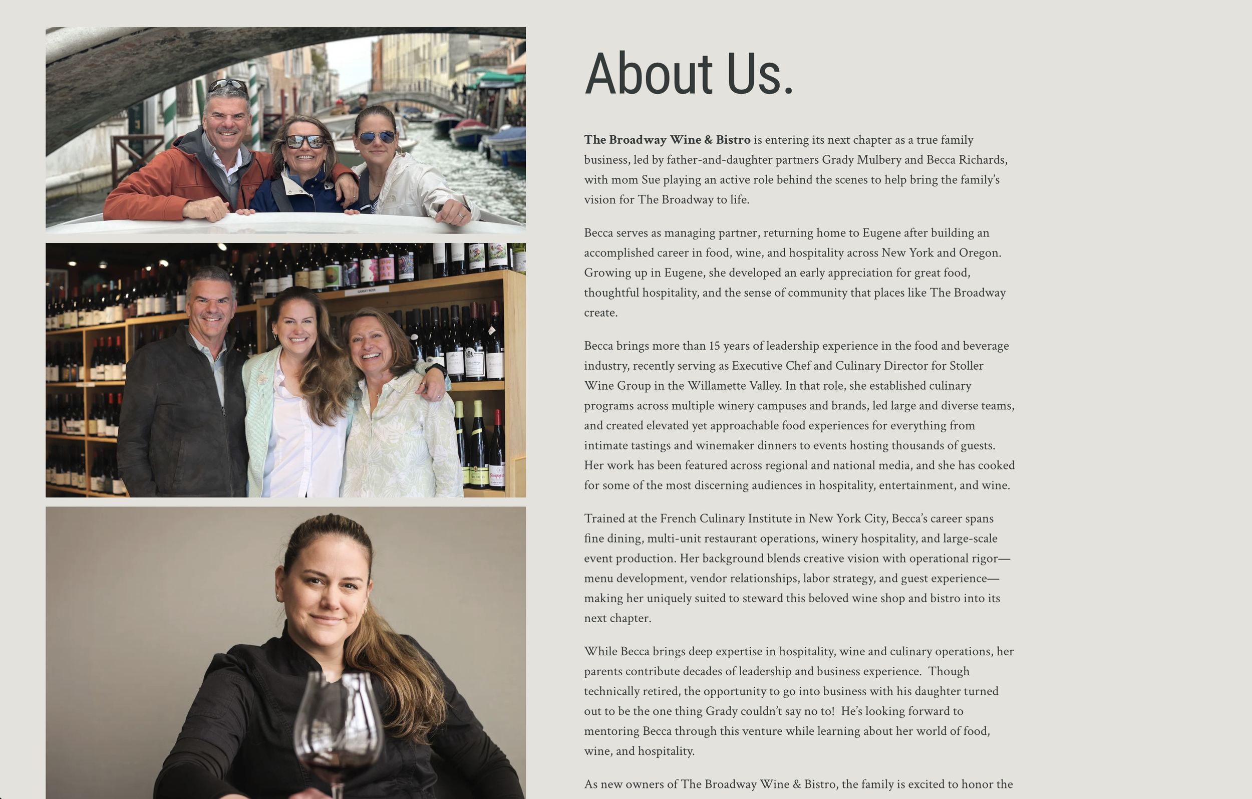
With the visual identity established, the next step was designing a web experience that brought the brand to life online. Developed in two distinct phases—launching first with core brand storytelling and venue details, followed by full e-commerce integration—the site reflects the warmth and expertise of the physical space.
The design prioritizes intuitive navigation and a welcoming tone, mirroring the in-person experience of being guided through their curated wine selection by knowledgeable hosts. I also provided copywriting services for this portion of the project.